|
November 25th, 2006, 00:26 Posted By: wraggster
Via DS Fanboy
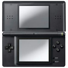
Reviews have been slow in coming for Konductra, the new DS puzzler from indie developer oeFun. Maybe the horrifically boring all-about video we showed you not long ago put everyone off. Or it could have been the yawnariffic gameplay. We're open to examining multiple possibilities here. Nearly every aspect of Konductra is raked over the coals in these reviews -- the methodology of gameplay, the missing element of risk that makes puzzle games exciting, and even the production values. In other words? Eminently skippable. But is it less fun because we've seen other, more exciting puzzlers on the DS, or is the gameplay itself flawed? Read on.
IGN - 65%: Konductra gives you too much control. In other puzzlers, blocks or tiles assault the playing field relentlessly - cascading into the pit in Tetris, or crashing down from orbit in Meteos. It's constant. It doesn't stop. Playing those games is playing for survival, trying to manage the stack and keep from being overwhelmed. Konductra isn't Tetris or Meteos, and no direct comparison is implied. Those games are simply used as examples to illustrate a quality Konductra lacks - a sense of danger.
Worth Playing - 50%: As a puzzle game, Konductra isn't expected to be a graphical powerhouse, and it isn't. The menu screens are graphically unimpressive and unwieldy (rather than simply picking an option, you must "highlight" it as if you were playing the game). The game board itself is simplistic and rather dull to look at, with only four colors and a non-existent background ... Konductra does manage to pull off a pretty good soundtrack. Trance-like peppy music plays over the gameplay, oddly out of sync with some of the early gameplay, although it does a better job of matching more intense difficulty levels. One nice addition is the game's full-voiced tutorial, although the game is not really complex enough to require such a detailed feature.
GameSpot - 42%: Even with seemingly so much going on in any given game, Konductra is boring and lifeless. A little personality could have helped matters, but the bare-bones presentation is unremarkable. There are no alternating skins, so you're stuck with a generic pulsing blue background surrounded by bland grey-and-white conductors. The blocks are shimmery and colorful, but no nicer than any number of free Flash PC games on the Internet. Accompanying it all is a small set of grating MIDI techno tunes that will make you glad you have the option to turn off the music.
Overall verdict? Ouch. But when there are so many brilliant handheld puzzlers, it's bound to be difficult for anything else to make a splash unless it's just as good, and it looks like Konductra simply isn't
For more information and downloads, click here!
 There are 0 comments - Join In and Discuss Here There are 0 comments - Join In and Discuss Here
|
|
 NES
NES