|
September 9th, 2006, 21:55 Posted By: wraggster
Heres the translated interview:
"The Design That Nobody Hates”
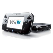
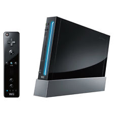
Mr.Takamoto is in charge of the structure of Wii console and Wiimote. Wii’s smallness — “the size of three DVD cases” — is one of the great feature of Wii console. Actually, Mr.Iwata was stacking three DVD cases, and said “I want Wii to be small like this”. Mr.Takamoto got bewildered rather than amazed. At first, he couldn’t understand why he have to make Wii such a small machine, but he was getting it gradually. Wii should be “unobtrusive presence” in living room. There are a lot of audio-video equipments around the TV, and Wii have to set near the TV because of the pointing device of Wiimote. Spaces between TV and AV equipments are very limited, so he understood that Wii have to be small. “The size of 2 DVD cases” was impossible, but they achieved “the size of 3 DVD cases”.
Mr.Takamoto told that The hardest thing was disc drive, which have to be almost the same width of one DVD case. If disc drive became thinner, it became more breakable. There are a lot of earlier age users, so Nintendo have a very strict standard. After a lot of trials and errors, they finally got it by internal reinforcing pad.
He also told that they strained at using slot-in drive. If they decided to use GameCube-like disc drive (opening the top to change discs), the width of the drive could be thinner, the cost could be cheaper, and the decay durability be better. But, as he said before, the space near TV is very limited, so they thought that Wii-users feel more comfortable by using slot-in for changeing discs.
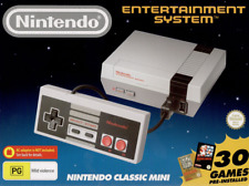
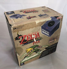
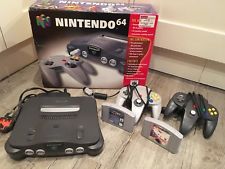
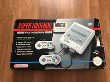
Mr.Ashida is in charge of the design of the Wii console, the Wiimote, the package and the logo. They don’t want to make it like a mad woman’s breakfast around the TV. Not only the matter of size but also shape. Nintendo64 had a lot of curves in its shape, so it was difficult to find the place to set it. On the other hand, the design of GameCube was “the design of toy”. From SNES, the designs of Nintendo’s console was like a toy, and this was intentional attempt. But the average of the ages of users has changed, he feels that the balance between the “toy-like” design and the “AV-equipment-like” design is very important. The keywords are, “the design that nobody hates”. Not a toy, not a AV equipment, they want Wii to be a kind of interior accessories. Mr.Ashida decided to form Wii-design team. The designs of Nintendo console used to pruduced by one designer, but this time, he consulted widely with young designers inside Nintendo.
The turing point was the idea of the stand. Young desiner produced the Wii’s stand, and it allows representing new shape by combine Wii with it. A few weeks before E3(2005), Mr.Ashida and his team finishd this design. At the first presentation to Mr. Iwata, they got the go-ahead. Then, the design was Made in public at E3, and Mr.Ashida was very, very surprized because hedidn’t know that the design was to be displayed at E3 2005.
More info
For more information and downloads, click here!
 There are 3 comments - Join In and Discuss Here There are 3 comments - Join In and Discuss Here
|
|
 NES
NES